Five days inside Snowflake Data Governance – Connect your Ecosystem
Snowflake’s Data Governance Framework focuses on three key areas. In this blog we will focus on the key area; ‘Five days inside Snowflake Data Governance – Connect your Ecosystem’.
Five days inside Snowflake Data Governance – Protect your Data
Snowflake’s Data Governance Framework focuses on three key areas. In this blog we will focus on the key area; ‘Protect your Data’.
Five days inside Snowflake Data Governance – Know your Data
Know your Data
This aspect of Snowflake’s Data Governance Framework is all about understanding your data and its quality, lineage, and usage. It answers questions about the What & the Where (Classification & Object Tagging) and the Who (Account Usage and Access History) of your data.
Five days inside Snowflake Data Governance – Intro
Next to being a Snowflake Data Cloud enthusiast and part of the Snowflake ❄️ Data Superheroes 2023, I am General Manager at Pong. We provide Professional Services where we help organizations solve data related challenges. We believe building data products with e.g. Snowflake, can only succeed when the fundament is in place. For us this fundament can be achieved by applying Data Governance. That’s why I am really interested which elements of Data Governance are supported by Snowflake.
Magic Quadrant for Analytics and Business Intelligence Platforms 2023
Earlier this month Gartner released a new version of the Magic Quadrant for Analytics and Business Intelligence Platforms (ABI). As always it is interesting to see what is happening in the market. Market Definition and Overview The market definition and overview in the Gartner report on “Magic Quadrant for Analytics and Business Intelligence Platforms” provides an overview of […]
Introducing Snowflake Worksheets for Python
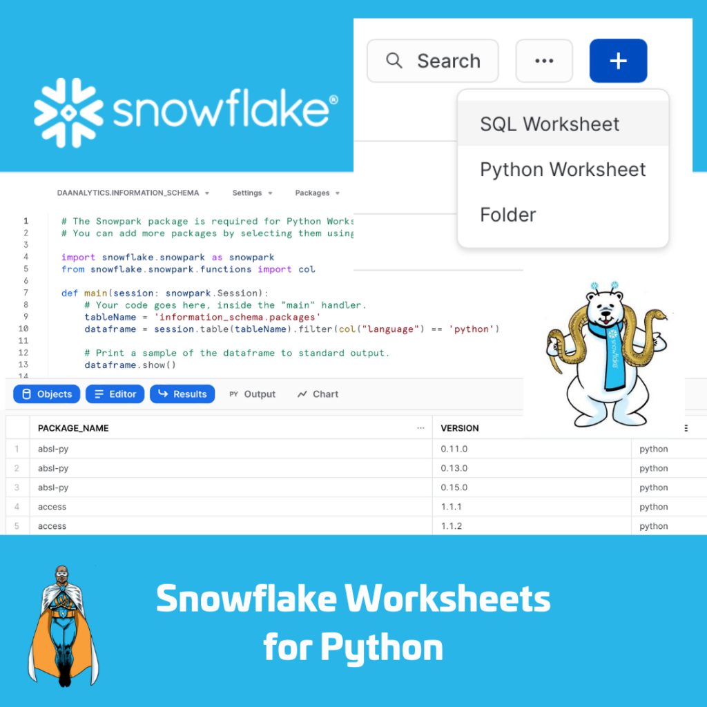
Recently Snowflake made working with Python from within Snowflake a little bit better. ‘Snowflake Worksheets for Python’ is in Public Preview, available for use for everybody. Time to find out how it works. Generate Faker Data I am planning a series of blogpost regarding Snowflake Data Governance in combination with Alation. Therefore I need some […]
Data Quality Framework in Snowflake & Streamlit

Data is one of the most important assets in organizations today. If you cannot trust the Data, decision making based on this Data is impossible. Measuring Data Quality is therefor essential. Inspired by the blogpost; “Data Quality Framework in Snowflake” of Divya Rajesh Surana, I decided to take it one step further by including Streamlit.
Plotting F1 Circuit Locations into a map on Streamlit on Hugging Face using Folium
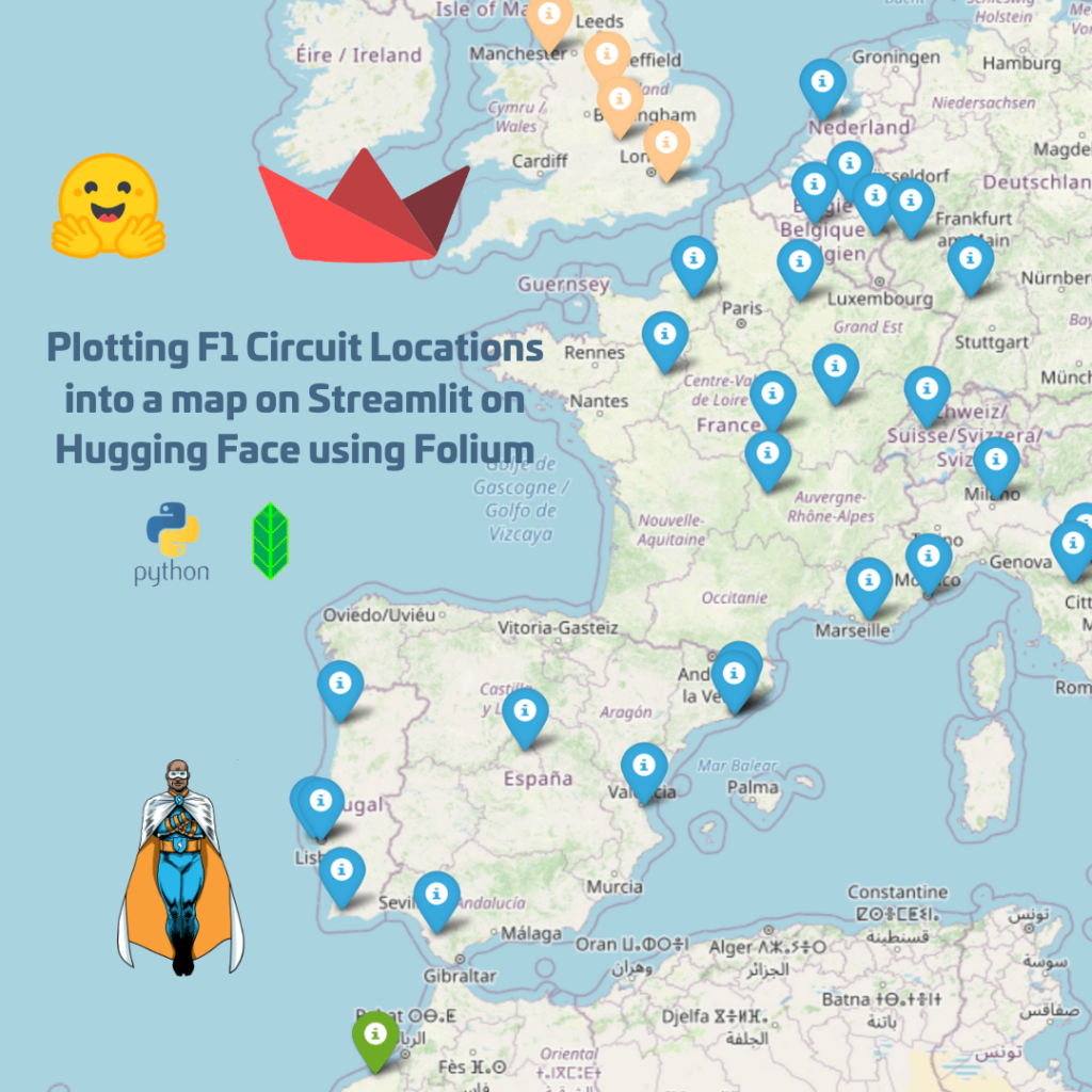
In my last blogpost I showed how to plot F1 Circuit Locations into a map using Folium on Streamlit. The idea is to switch between the World, a possible Continent and a possible Country.
Next step would be setting things up in Streamlit Cloud.
Plotting F1 Circuit Locations into a map on Streamlit Cloud using Folium
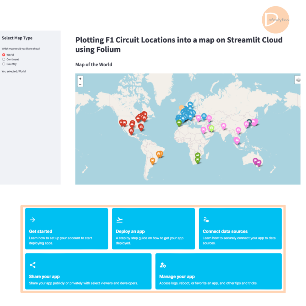
In my last blogpost I showed how to plot F1 Circuit Locations into a map using Folium on Streamlit. The idea is to switch between the World, a possible Continent and a possible Country.
Next step would be setting things up in Streamlit Cloud.
Plotting F1 Circuit Locations into a map on Streamlit using Folium
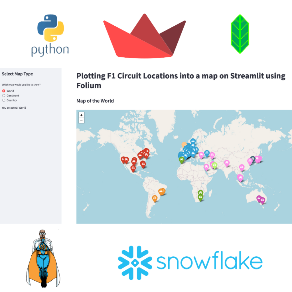
In my last blogpost I showed how to plot F1 Circuit Locations into a map using Folium. This was a very static way to plot the F1 Circuit Locations either for the World, Europe or France. These options were hardcoded in the notebook and showed after each other.
Next step would be to make the solution more interactive, using Streamlit. The idea is to switch between the World, a possible Continent and a possible Country.