In my last blogpost I showed how to plot F1 Circuit Locations into a map using Folium. This was a very static way to plot the F1 Circuit Locations either for the World, Europe or France. These options were hardcoded in the notebook and showed after each other.
Next step would be to make the solution more interactive, using Streamlit. The idea is to switch between the World, a possible Continent and a possible Country. Check the video below.
To make the above possible, I have taken the code from the last blogpost. As I presented at BUILD.local last month, it’s relatively straight forward to get started with Streamlit. There are a few things to take into consideration.
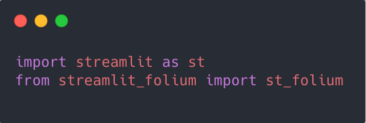
- To make things work in Streamlit (compared to the previous notebook) the necessary additional Python libraries have to be installed and imported.
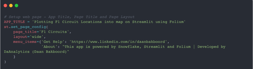
- Streamlit Page settings come before all the other logic
Compared to the previous blogpost, Streamlit should include some more interactivity. Therefore the logic has to be changed to be able to select and filter different values.
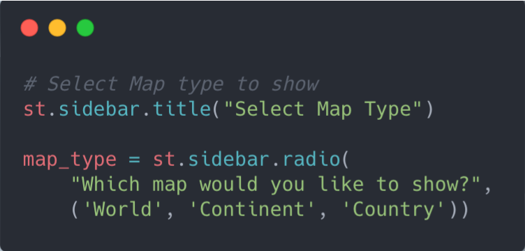
I used a s Streamlit-statement; ‘st.sidebar’ to put some controls in the Sidebar of the Streamlit application.
- Adding filter(s) – Radio button to select between the World, a possible Continent and a possible Country
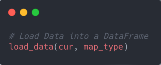
- Load data based on the selected ‘Map Type’
- Create Datasets, based on the selected ‘Map Type’; One query for the ‘World’, selections based on this query for ‘Continent’ and ‘Country’.
- Show a different ‘Select Box’ based on the selected ‘Map Type’
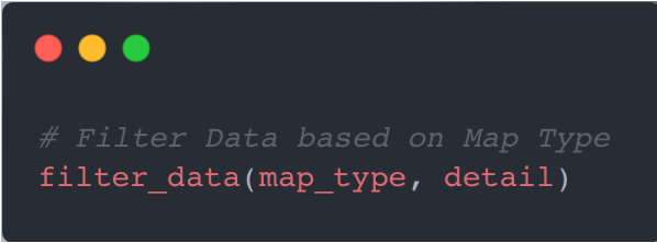
- Filter Data based on the selection per ‘Map Type’
- Create Data Set for the Folium map not be drawed based on the selection per ‘Map Type’
- Draw the Folium Map based on the selection per ‘Map Type’
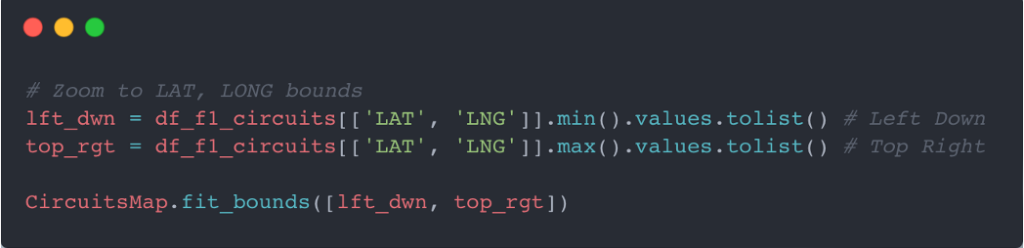
Note: Zoom the Folium Map based on the ‘Latitude / Longitude’-edges (Left Down and Top Right) of the selected circuits.
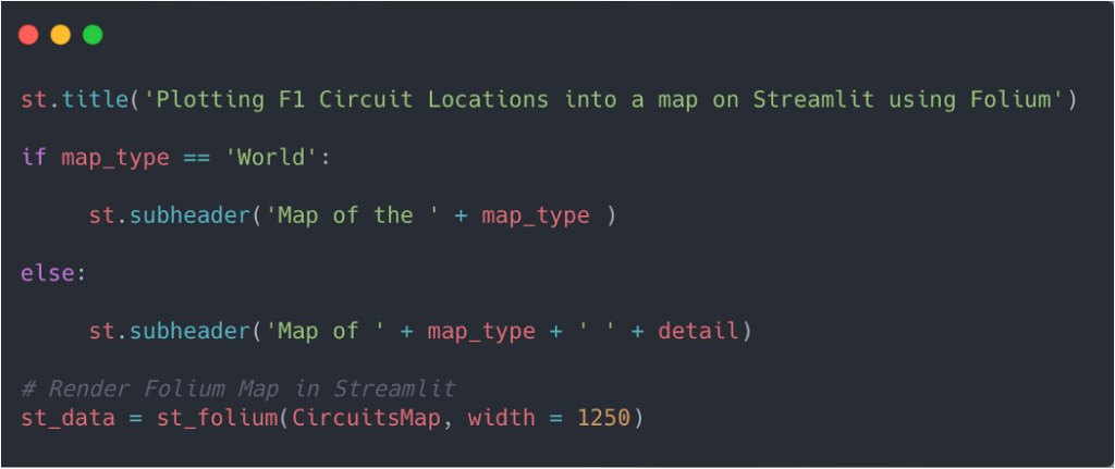
- Finally putting everything together and show the final Streamlit application with the Folium map, showing the circuits in the selected area.
Closing Statements
The previous example provided the steps to plot F1 Circuit Locations into a map using Folium; a Python library used for visualizing Geospatial Data. In this example I added some interactivity with Streamlit. Please check it out and let me know what you think. The code is on Github.
I also tried to set things up in Streamlit Cloud. Unfortunately at time of writing I have ran into issues, which I am unable to solve, yet. I am currently trying via some experts on the forum.
Till next time.