Five days inside Snowflake Summit 2023 – Wrap up
The last 4 days I looked back at the Snowflake Summit 2023. This post is a short wrap up of all things I have covered these days.
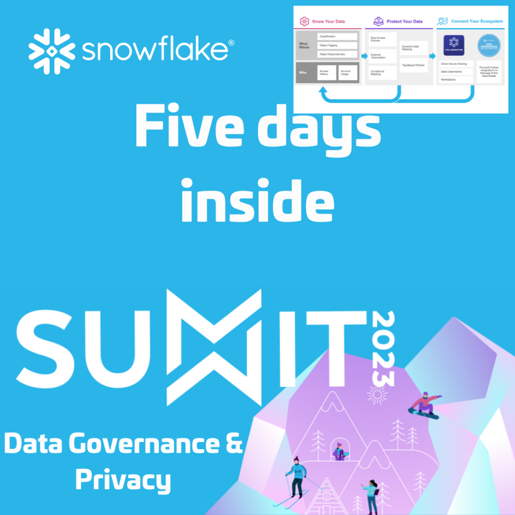
Five days inside Snowflake Summit 2023 – Data Governance & Privacy
I have stated earlier in a blogpost that, next to being a Snowflake Data Cloud enthusiast and part of the Snowflake ❄️ Data Superheroes 2023, I am also Director Data & AI at Pong. We provide Professional Services where we help organizations solve data related challenges. We believe building data products with e.g. Snowflake, can […]
Five days inside Snowflake Summit 2023 – Data Superheroes
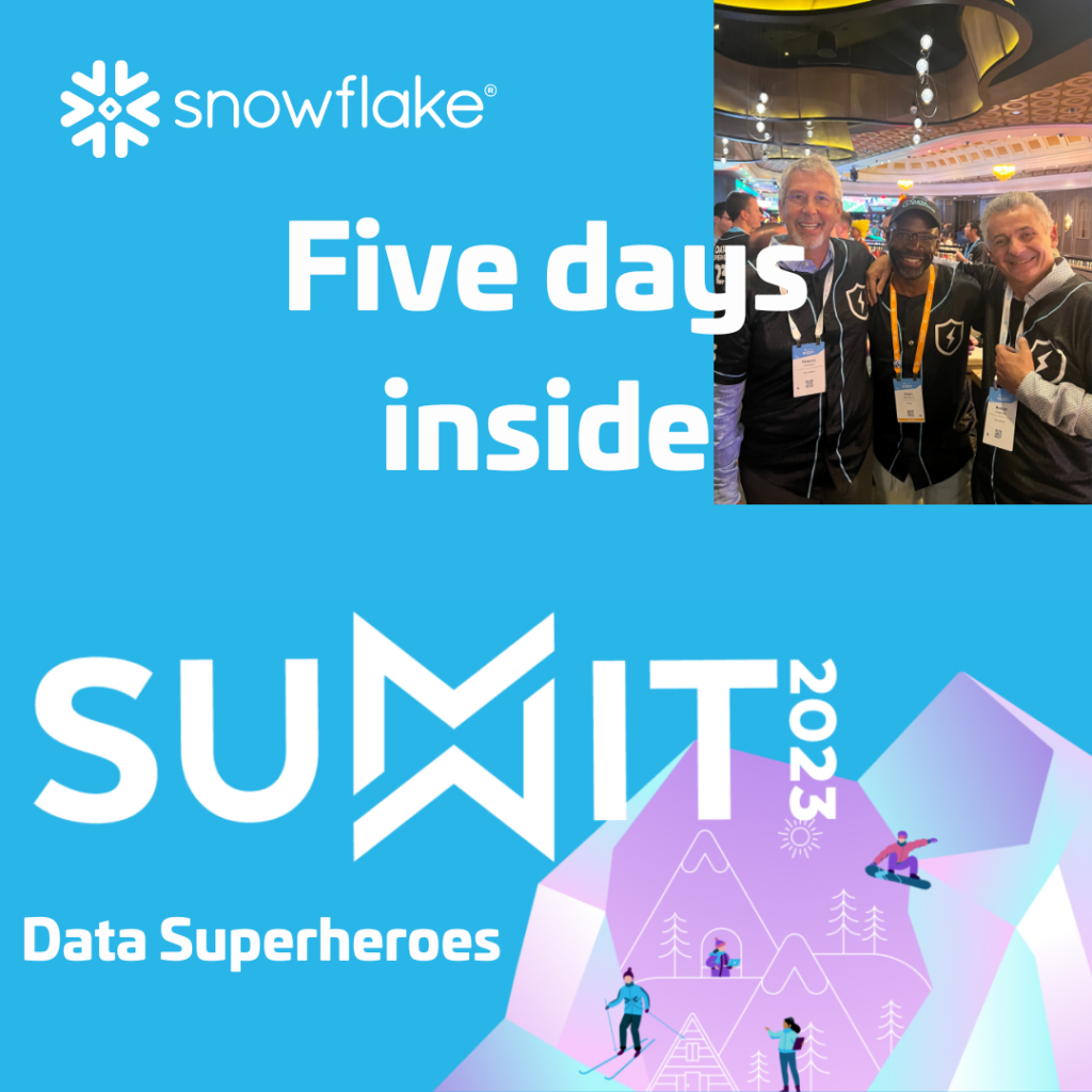
I have been a Snowflake ❄️ Data Superhero since the early days of the program. The Data Superhero program has evolved since then. It’s a community program which comes with more and more benefits. I am not talking about all the swag we receive. I can almost start my own personal Snowstore. The benefits I […]
Five days inside Snowflake Summit 2023 – Generative AI
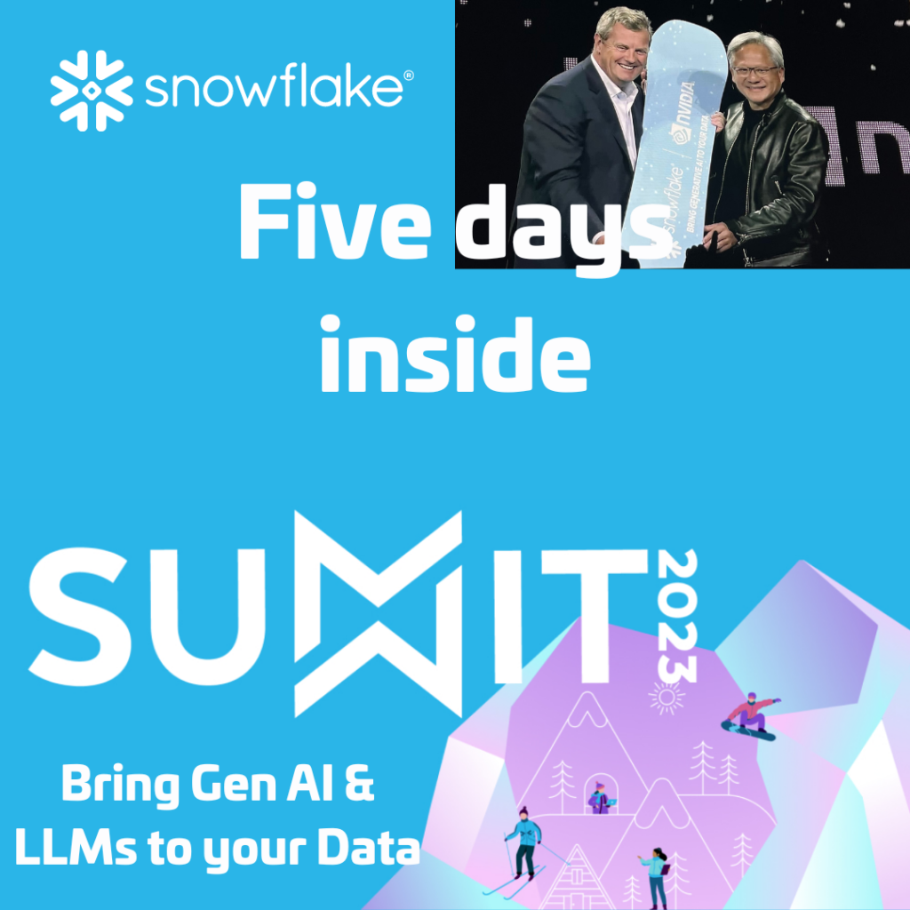
One of the central themes during Snowflake Summit 2023 was bringing Generative AI and Large Language Models to your Data. According to Snowflake’s CEO it’s just like they removed all letters from the alphabet and just left the A and the I there. According to him it could also be a drinking game; take a […]
Five days inside Snowflake Data Governance – Data Governance Accelerated
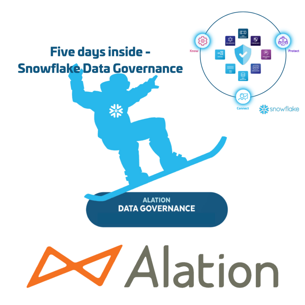
Snowflake’s Data Governance Framework focuses on three key areas. In this blog we will focus on the key area; ‘Five days inside Snowflake Data Governance – Connect your Ecosystem’. Specifically Data Governance Accelerated with Alation.
Five days inside Snowflake Data Governance – Connect your Ecosystem

Snowflake’s Data Governance Framework focuses on three key areas. In this blog we will focus on the key area; ‘Five days inside Snowflake Data Governance – Connect your Ecosystem’.
Five days inside Snowflake Data Governance – Protect your Data

Snowflake’s Data Governance Framework focuses on three key areas. In this blog we will focus on the key area; ‘Protect your Data’.
Five days inside Snowflake Data Governance – Know your Data
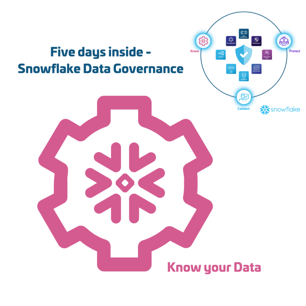
Know your Data
This aspect of Snowflake’s Data Governance Framework is all about understanding your data and its quality, lineage, and usage. It answers questions about the What & the Where (Classification & Object Tagging) and the Who (Account Usage and Access History) of your data.
Five days inside Snowflake Data Governance – Intro

Next to being a Snowflake Data Cloud enthusiast and part of the Snowflake ❄️ Data Superheroes 2023, I am General Manager at Pong. We provide Professional Services where we help organizations solve data related challenges. We believe building data products with e.g. Snowflake, can only succeed when the fundament is in place. For us this fundament can be achieved by applying Data Governance. That’s why I am really interested which elements of Data Governance are supported by Snowflake.
Introducing Snowflake Worksheets for Python
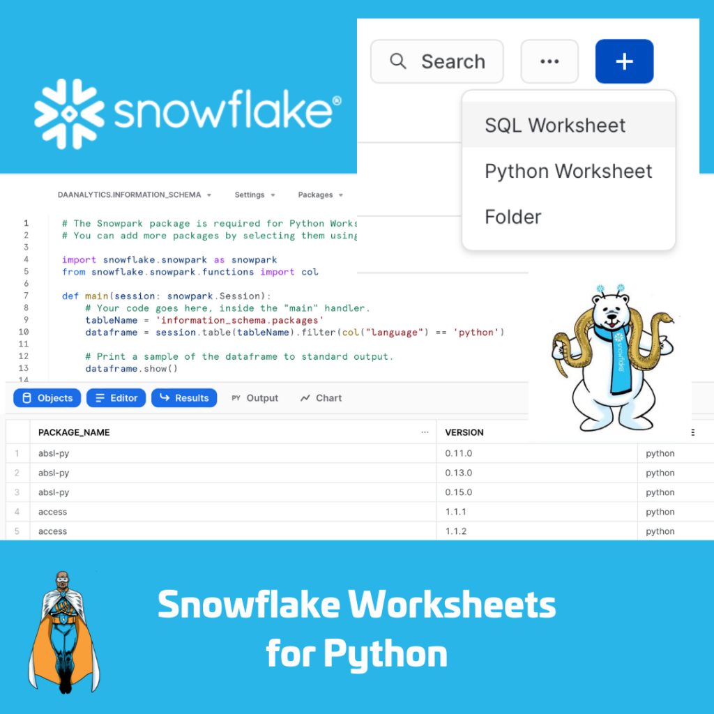
Recently Snowflake made working with Python from within Snowflake a little bit better. ‘Snowflake Worksheets for Python’ is in Public Preview, available for use for everybody. Time to find out how it works. Generate Faker Data I am planning a series of blogpost regarding Snowflake Data Governance in combination with Alation. Therefore I need some […]